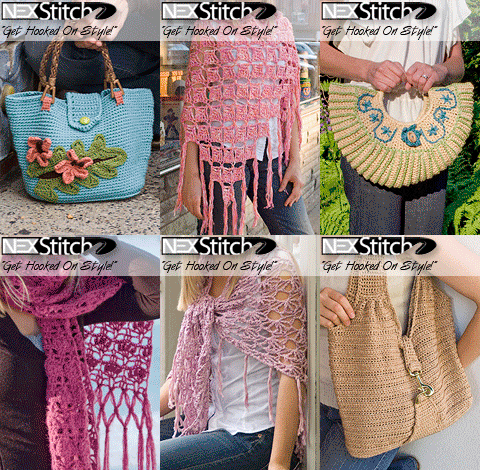
It’s been awhile since I’ve posted. I think I just needed some time away alone with my thoughts. It’s been an emotional two months to say the least. I’ve kept most of my babbling to a 140 character count over at . Less is more these days. I do promise though, with the summer coming up, that I’ll post more since I’ll be home more.
I just want to take a moment to thank everyone who posted here or sent me emails in regards to my step-father passing. I can’t begin to express how comforting your words were to me at that difficult time. I cried, I smiled, and cried again at each post or email sent.
I think work immediately became my coping mechanism, keeping me so busy that I didn’t have time to crawl too far into my own head space. Between my two clients, Mary Beth Temple and Marty Miller (new client) and my crazy day job, I had enough things to do to occupy my time. Both clients were planning on selling patterns wholesale at TNNA, with Mary Beth signing her latest and greatest book, “DIY Afghans” at the Leisure Arts booth. And both had a bunch of patterns as well as other graphics needed for the show. At the height of the workload, I was clocking 18 hour work days on weekdays and long hours on the weekends since there was a ton to do.
Mx2
Marty approached me because she was interested in selling patterns wholesale. She wanted a simple pattern layout using Carolina Blue as the main color inspiration. It was important that her pictures and important text be near the top of the page so they’d be seen if they were being stocked on shelves in an LYS. This is what I came up with:

Marty also needed a logo to accompany the patterns. She wanted “Mx2,” meaning the letter “M” performed twice, as in “M” being done twice in a crochet pattern – the two M’s standing for Marty Miller. I thought it was a brilliantly clever idea. She also said she’d like it to look like it had been written as a crochet pattern. After two unsuccessful attempts at making what she wanted (I either went too fancy with the chosen crochet symbol or it wasn’t cool enough), I came up with this:

I was really happy with this effort. It utilizes a few of the colors from the layout, It’s fun and simple, like the layout. And I think it reads well. The breakthrough in the design came when I made the “2″ look like a double crochet symbol. It related well to the “M” and thus a logo was born.
So now that the chaos of dealing with two clients with the same deadline is over, I have a new deadline for something very important happening in August that I will share with you shortly. This’ll be something else that occupies my time for the summer, something I’ve been waiting for during the last 4 1/2 years. And yes, it involves a little crochet.
Stay tuned!

The logo you came up with is really neat!! And that new August deadline? Bet I could guess, but I’ll keep it to myself just in case I’m wrong. (grin)